Hep & Cask Identity
Hep & Cask is a lifestyle blog crafted to uplift people through photography, positive writing, local hangout reviews & a classic drink recipe or two. When Christopher first introduced his swanky vision for a blog to me, I was instantly hooked. It was a bonus that we met at one of my favorite coffee shops to discuss his intent for the blog. Hep is a 1940's spin on the word hip (Bing Crosby was known as a hepster back in the day, ha!). It was the era of jazz, Jack Kerouac & fedoras.
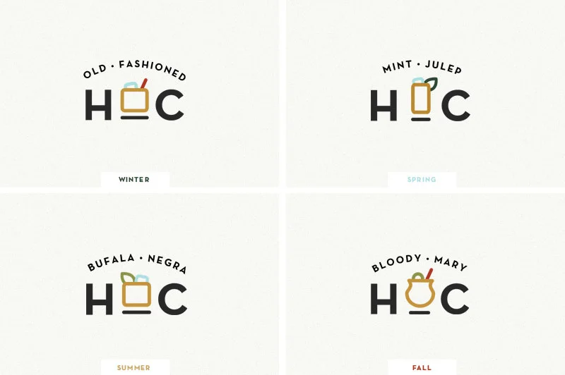
Christopher mixed his admiration for this rebellious time in history with his vast knowledge of bourbon to encapsulate the spirit of his blog. He wants his readers to feel sanguine & relaxed as they read on, leaving the space with a bit of optimism & swagger as they go about their day. I wanted his logo suite to capture this essence so a geometric sans-serif typeface, Neutraface, is used for a classic yet modern feel. Soft-shaped drink icons take the ampersand's place in a palette of boozy colors with the option to rotate seasonally. Could anybody else use an Old-Fashioned right about now?!
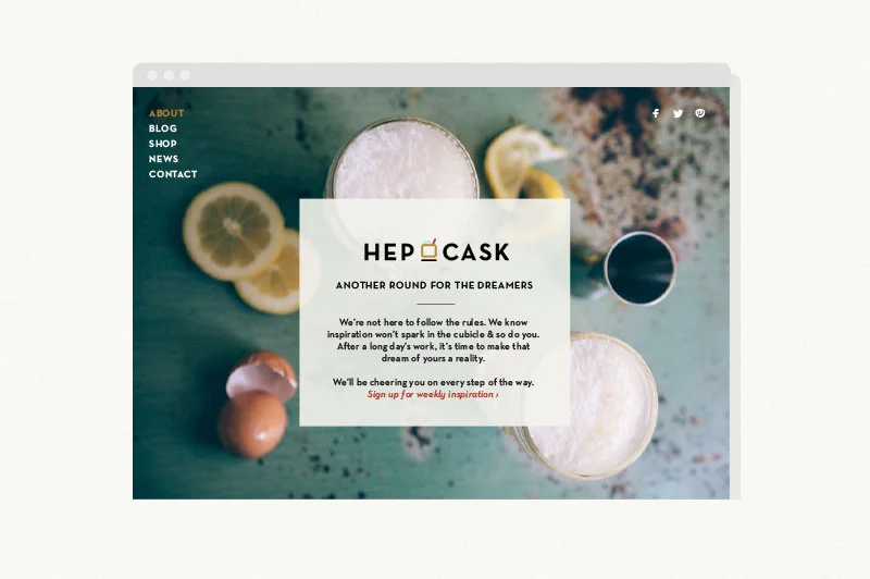
Using the Squarespace template, Aviator, the Hep & Cask home page invites readers to join a weekly newsletter to receive original photography from Christopher & positive quotes for their week (with a little prompt to go do that thing you can't get out of your head). I loved working with Christopher on his identity & can't wait for it to go live (I jumped the gun a bit early to give you a sneak peek)!
Working with people like Christopher has opened me up to new perspectives, experiences & interests. I would've never known the origin of the word "hipster", wouldn't be able to tell you the history of the Kentucky Bourbon Trail & sure as hell wouldn't be able to tell the difference between an Old-Fashioned & a Bufala Negra if it weren't for this opportunity. Cheers to having a vision & seeing it through.
Looking to launch a dream of your own? Let's chat.
Photos courtesy of Death to the Stock Photo & Nothing But Delicious


